PageGrid (페이지그리드)
유연한 레이아웃으로 콘텐츠를 표시하기 위한 반응형 그리드 시스템
Usage
PageGrid 구성 요소는 PageCard 구성 요소 또는 다른 요소를 표시하는 응답형 격자 레이아웃을 제공하며 화면 크기에 따라 1-3열을 자동으로 조정합니다.
<script setup lang="ts">
const cards = ref([
  {
    title: 'Icons',
    description: 'Nuxt UI integrates with Nuxt Icon to access over 200,000+ icons from Iconify.',
    icon: 'i-lucide-smile',
    to: '/docs/getting-started/integrations/icons'
  },
  {
    title: 'Fonts',
    description: 'Nuxt UI integrates with Nuxt Fonts to provide plug-and-play font optimization.',
    icon: 'i-lucide-a-large-small',
    to: '/docs/getting-started/integrations/fonts'
  },
  {
    title: 'Color Mode',
    description: 'Nuxt UI integrates with Nuxt Color Mode to switch between light and dark.',
    icon: 'i-lucide-sun-moon',
    to: '/docs/getting-started/integrations/color-mode'
  }
])
</script>

<template>
  <UPageGrid>
    <UPageCard
      v-for="(card, index) in cards"
      :key="index"
      v-bind="card"
    />
  </UPageGrid>
</template>
<script setup lang="ts">
import { ref, provide } from 'vue'

const cards = ref([
  {
    title: 'Icons',
    description: 'Nuxt UI integrates with Nuxt Icon to access over 200,000+ icons from Iconify.',
    icon: 'i-lucide-smile',
    to: '/docs/getting-started/integrations/icons'
  },
  {
    title: 'Fonts',
    description: 'Nuxt UI integrates with Nuxt Fonts to provide plug-and-play font optimization.',
    icon: 'i-lucide-a-large-small',
    to: '/docs/getting-started/integrations/fonts'
  },
  {
    title: 'Color Mode',
    description: 'Nuxt UI integrates with Nuxt Color Mode to switch between light and dark.',
    icon: 'i-lucide-sun-moon',
    to: '/docs/getting-started/integrations/color-mode'
  }
])
</script>

<template>
  <UPageGrid>
    <UPageCard
      v-for="(card, index) in cards"
      :key="index"
      v-bind="card"
    />
  </UPageGrid>
</template>
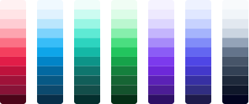
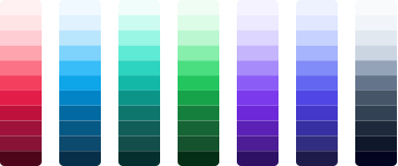
또한 col-span-* 및 row-span-* 유틸리티 클래스를 사용하여 bento 스타일 레이아웃에 카드 리스트를 표시할 수도 있습니다.
<script setup lang="ts">
const cards = ref([
  {
    title: 'Theme',
    description: 'Learn how to customize Nuxt UI components using Tailwind CSS.',
    icon: 'i-lucide-swatch-book',
    to: '/docs/getting-started/theme/design-system',
    class: 'lg:col-span-2',
    image: {
      path: 'https://ui2.nuxt.com/illustrations/color-palette',
      width: 363,
      height: 152
    },
    orientation: 'horizontal' as const
  },
  {
    title: 'Fonts',
    description: 'Nuxt UI integrates with Nuxt Fonts to provide plug-and-play font optimization.',
    icon: 'i-lucide-a-large-small',
    to: '/docs/getting-started/integrations/fonts',
    variant: 'soft' as const
  },
  {
    title: 'Color Mode',
    description: 'Nuxt UI integrates with Nuxt Color Mode to switch between light and dark.',
    icon: 'i-lucide-sun-moon',
    to: '/docs/getting-started/integrations/color-mode',
    variant: 'soft' as const
  },
  {
    title: 'Icons',
    description: 'Nuxt UI integrates with Nuxt Icon to access over 200,000+ icons from Iconify.',
    icon: 'i-lucide-smile',
    to: '/docs/getting-started/integrations/icons',
    image: {
      path: 'https://ui2.nuxt.com/illustrations/icon-library',
      width: 362,
      height: 184
    },
    class: 'lg:col-span-2',
    orientation: 'horizontal' as const,
    reverse: true
  }
])
</script>

<template>
  <UPageGrid>
    <UPageCard
      v-for="(card, index) in cards"
      :key="index"
      v-bind="card"
    >
      <UColorModeImage
        v-if="card.image"
        :light="`${card.image.path}-light.svg`"
        :dark="`${card.image.path}-dark.svg`"
        :width="card.image.width"
        :height="card.image.height"
        :alt="card.title"
        loading="lazy"
        class="w-full"
      />
    </UPageCard>
  </UPageGrid>
</template>
<script setup lang="ts">
import { ref, provide } from 'vue'

const cards = ref([
  {
    title: 'Theme',
    description: 'Learn how to customize Nuxt UI components using Tailwind CSS.',
    icon: 'i-lucide-swatch-book',
    to: '/docs/getting-started/theme/design-system',
    class: 'lg:col-span-2',
    image: {
      path: 'https://ui2.nuxt.com/illustrations/color-palette',
      width: 363,
      height: 152
    },
    orientation: 'horizontal' as const
  },
  {
    title: 'Fonts',
    description: 'Nuxt UI integrates with Nuxt Fonts to provide plug-and-play font optimization.',
    icon: 'i-lucide-a-large-small',
    to: '/docs/getting-started/integrations/fonts',
    variant: 'soft' as const
  },
  {
    title: 'Color Mode',
    description: 'Nuxt UI integrates with Nuxt Color Mode to switch between light and dark.',
    icon: 'i-lucide-sun-moon',
    to: '/docs/getting-started/integrations/color-mode',
    variant: 'soft' as const
  },
  {
    title: 'Icons',
    description: 'Nuxt UI integrates with Nuxt Icon to access over 200,000+ icons from Iconify.',
    icon: 'i-lucide-smile',
    to: '/docs/getting-started/integrations/icons',
    image: {
      path: 'https://ui2.nuxt.com/illustrations/icon-library',
      width: 362,
      height: 184
    },
    class: 'lg:col-span-2',
    orientation: 'horizontal' as const,
    reverse: true
  }
])
</script>

<template>
  <UPageGrid>
    <UPageCard
      v-for="(card, index) in cards"
      :key="index"
      v-bind="card"
    >
      <UColorModeImage
        v-if="card.image"
        :light="`${card.image.path}-light.svg`"
        :dark="`${card.image.path}-dark.svg`"
        :width="card.image.width"
        :height="card.image.height"
        :alt="card.title"
        loading="lazy"
        class="w-full"
      />
    </UPageCard>
  </UPageGrid>
</template>
API
Props 코드 코드
| Prop | Default | Type |
|---|---|---|
as | 'div' | anyThe element or component this component should render as. |
ui | { base?: any; } |
Slots
| Slot | Type |
|---|---|
default | {} |
Theme 테마
app.config.ts
export default defineAppConfig({
  ui: {
    pageGrid: {
      base: 'relative grid grid-cols-1 sm:grid-cols-2 lg:grid-cols-3 gap-8'
    }
  }
})vite.config.ts
import { defineConfig } from 'vite'
import vue from '@vitejs/plugin-vue'
import ui from '@nuxt/ui/vite'

export default defineConfig({
  plugins: [
    vue(),
    ui({
      ui: {
        pageGrid: {
          base: 'relative grid grid-cols-1 sm:grid-cols-2 lg:grid-cols-3 gap-8'
        }
      }
    })
  ]
})변경 로그
No recent changes