블로그포스트 (BlogPost)
블로그 페이지에 표시할 사용자 정의 가능한 문서입니다.
Usage
BlogPost 구성 요소는 제목, 설명, 이미지 등을 포함하여 사용자 정의 가능한 콘텐츠가 포함된 <article> 요소를 유연하게 표시할 수 있는 방법을 제공합니다.
Title
title prop을 사용하여 BlogPost의 제목을 표시합니다.
Introducing Nuxt Icon v1
<template>
  <UBlogPost title="Introducing Nuxt Icon v1" />
</template>
설명
description prop을 사용하여 BlogPost에 대한 설명을 표시합니다.
Introducing Nuxt Icon v1
Discover Nuxt Icon v1 - a modern, versatile, and customizable icon solution for your Nuxt projects.
<template>
  <UBlogPost
    title="Introducing Nuxt Icon v1"
    description="Discover Nuxt Icon v1 - a modern, versatile, and customizable icon solution for your Nuxt projects."
  />
</template>
Date 날짜
date prop을 사용하여 BlogPost의 날짜를 표시합니다.
날짜 형식은 current locale로 자동 지정됩니다.
Date 객체나 문자열을 전달할 수 있습니다.Introducing Nuxt Icon v1
Discover Nuxt Icon v1 - a modern, versatile, and customizable icon solution for your Nuxt projects.
<template>
  <UBlogPost
    title="Introducing Nuxt Icon v1"
    description="Discover Nuxt Icon v1 - a modern, versatile, and customizable icon solution for your Nuxt projects."
    date="2024-11-25"
  />
</template>
Badge
badge prop를 사용하여 BlogPost에 Badge를 표시합니다.
Release
Introducing Nuxt Icon v1
Discover Nuxt Icon v1 - a modern, versatile, and customizable icon solution for your Nuxt projects.
<template>
  <UBlogPost
    title="Introducing Nuxt Icon v1"
    description="Discover Nuxt Icon v1 - a modern, versatile, and customizable icon solution for your Nuxt projects."
    badge="Release"
  />
</template>
Badge 구성 요소의 모든 속성을 전달하여 사용자 정의할 수 있습니다.
Release
Introducing Nuxt Icon v1
Discover Nuxt Icon v1 - a modern, versatile, and customizable icon solution for your Nuxt projects.
<template>
  <UBlogPost
    title="Introducing Nuxt Icon v1"
    description="Discover Nuxt Icon v1 - a modern, versatile, and customizable icon solution for your Nuxt projects."
    :badge="{
      label: 'Release',
      color: 'primary',
      variant: 'solid'
    }"
  />
</template>
Image 이미지
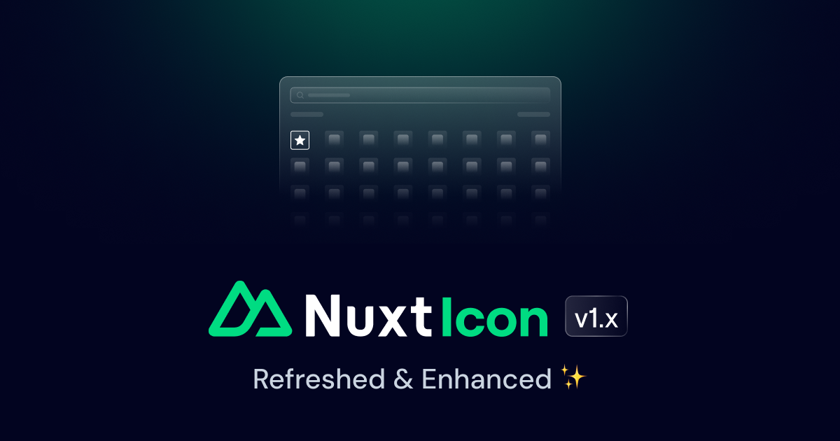
image prop을 사용하여 BlogPost에 이미지를 표시합니다.
Introducing Nuxt Icon v1
Discover Nuxt Icon v1 - a modern, versatile, and customizable icon solution for your Nuxt projects.
<template>
  <UBlogPost
    title="Introducing Nuxt Icon v1"
    description="Discover Nuxt Icon v1 - a modern, versatile, and customizable icon solution for your Nuxt projects."
    image="https://nuxt.com/assets/blog/nuxt-icon/cover.png"
    date="2024-11-25"
  />
</template>
authors 사용자
authors prop을 사용하여 BlogPost에 User 목록을 다음과 같은 속성을 가진 객체 배열로 표시합니다.
name?: stringdescription?: stringavatar?: Omit<AvatarProps, 'size'>-avatar?: Omit<AvatarProps, 'size'>의 최상위 리뷰chip?: boolean | Omit<ChipProps, 'size' | 'inset'>size?: UserProps['size'](-size?: UserProps['size'])orientation?: UserProps['orientation']
Link 구성 요소의 모든 속성을 to, target 등으로 전달할 수 있습니다.
<script setup lang="ts">
import type { UserProps } from '@nuxt/ui'

const authors = ref<UserProps[]>([
  {
    name: 'Anthony Fu',
    description: 'antfu7',
    avatar: {
      src: 'https://github.com/antfu.png',
      loading: 'lazy'
    },
    to: 'https://github.com/antfu',
    target: '_blank'
  }
])
</script>

<template>
  <UBlogPost
    title="Introducing Nuxt Icon v1"
    description="Discover Nuxt Icon v1 - a modern, versatile, and customizable icon solution for your Nuxt projects."
    image="https://nuxt.com/assets/blog/nuxt-icon/cover.png"
    date="2024-11-25"
    :authors="authors"
  />
</template><script setup lang="ts">
import { ref } from 'vue'
import type { UserProps } from '@nuxt/ui'
const authors = ref<UserProps[]>([
{
name: 'Anthony Fu',
description: 'antfu7',
avatar: {
src: 'https://github.com/antfu.png',
loading: 'lazy'
},
to: 'https://github.com/antfu',
target: '_blank'
}
])
</script>
<template>
<UBlogPost
title="Introducing Nuxt Icon v1"
description="Discover Nuxt Icon v1 - a modern, versatile, and customizable icon solution for your Nuxt projects."
image="https://nuxt.com/assets/blog/nuxt-icon/cover.png"
date="2024-11-25"
:authors="authors"
/>
</template>authors prop에 여러 개의 아이템이 있는 경우 AvatarGroup 컴포넌트가 사용됩니다.
Introducing Nuxt Icon v1
Discover Nuxt Icon v1 - a modern, versatile, and customizable icon solution for your Nuxt projects.


<script setup lang="ts">
import type { UserProps } from '@nuxt/ui'

const authors = ref<UserProps[]>([
  {
    name: 'Anthony Fu',
    description: 'antfu7',
    avatar: {
      src: 'https://github.com/antfu.png',
      loading: 'lazy'
    },
    to: 'https://github.com/antfu',
    target: '_blank'
  },
  {
    name: 'Benjamin Canac',
    description: 'benjamincanac',
    avatar: {
      src: 'https://github.com/benjamincanac.png',
      loading: 'lazy'
    },
    to: 'https://github.com/benjamincanac',
    target: '_blank'
  }
])
</script>

<template>
  <UBlogPost
    title="Introducing Nuxt Icon v1"
    description="Discover Nuxt Icon v1 - a modern, versatile, and customizable icon solution for your Nuxt projects."
    image="https://nuxt.com/assets/blog/nuxt-icon/cover.png"
    date="2024-11-25"
    :authors="authors"
  />
</template><script setup lang="ts">
import { ref } from 'vue'
import type { UserProps } from '@nuxt/ui'
const authors = ref<UserProps[]>([
{
name: 'Anthony Fu',
description: 'antfu7',
avatar: {
src: 'https://github.com/antfu.png',
loading: 'lazy'
},
to: 'https://github.com/antfu',
target: '_blank'
},
{
name: 'Benjamin Canac',
description: 'benjamincanac',
avatar: {
src: 'https://github.com/benjamincanac.png',
loading: 'lazy'
},
to: 'https://github.com/benjamincanac',
target: '_blank'
}
])
</script>
<template>
<UBlogPost
title="Introducing Nuxt Icon v1"
description="Discover Nuxt Icon v1 - a modern, versatile, and customizable icon solution for your Nuxt projects."
image="https://nuxt.com/assets/blog/nuxt-icon/cover.png"
date="2024-11-25"
:authors="authors"
/>
</template>Link 링크
<NuxtLink> 구성 요소에서 to, target, rel 등의 속성을 전달할 수 있습니다.
<template>
  <UBlogPost
    title="Introducing Nuxt Icon v1"
    description="Discover Nuxt Icon v1 - a modern, versatile, and customizable icon solution for your Nuxt projects."
    image="https://nuxt.com/assets/blog/nuxt-icon/cover.png"
    date="2024-11-25"
    to="https://nuxt.com/blog/nuxt-icon-v1-0"
    target="_blank"
  />
</template>
변형
variant prop을 사용하여 BlogPost의 스타일을 변경합니다.
<template>
  <UBlogPost
    title="Introducing Nuxt Icon v1"
    description="Discover Nuxt Icon v1 - a modern, versatile, and customizable icon solution for your Nuxt projects."
    image="https://nuxt.com/assets/blog/nuxt-icon/cover.png"
    date="2024-11-25"
    to="https://nuxt.com/blog/nuxt-icon-v1-0"
    target="_blank"
    variant="naked"
  />
</template>
스타일링은
to prop 또는 image를 제공하는 다른 weather 일 것입니다.방향
orientation prop을 사용하여 BlogPost 방향을 변경합니다. 기본값은 vertical입니다.
<template>
  <UBlogPost
    title="Introducing Nuxt Icon v1"
    description="Discover Nuxt Icon v1 - a modern, versatile, and customizable icon solution for your Nuxt projects."
    image="https://nuxt.com/assets/blog/nuxt-icon/cover.png"
    date="2024-11-25"
    to="https://nuxt.com/blog/nuxt-icon-v1-0"
    target="_blank"
    orientation="horizontal"
    variant="outline"
  />
</template>
API
Props (### Props)
| Prop | Default | Type |
|---|---|---|
as | 'article' | anyThe element or component this component should render as. |
title | string | |
description | string | |
date | string | DateThe date of the blog post. Can be a string or a Date object. | |
badge | string | BadgePropsDisplay a badge on the blog post.
Can be a string or an object.
| |
authors | UserProps[]The authors of the blog post. | |
image | string | Partial<ImgHTMLAttributes> & { [key: string]: any; }The image of the blog post. Can be a string or an object. | |
orientation | 'vertical' | "vertical" | "horizontal"The orientation of the blog post. |
variant | 'outline' | "outline" | "soft" | "subtle" | "ghost" | "naked" |
to | string | it | et | |
target | null | "_blank" | "_parent" | "_self" | "_top" | string | |
ui | { root?: SlotClass; header?: SlotClass; body?: SlotClass; footer?: SlotClass; image?: SlotClass; title?: SlotClass; description?: SlotClass; authors?: SlotClass; avatar?: SlotClass; meta?: SlotClass; date?: SlotClass; badge?: SlotClass; } |
Slots
| Slot | Type |
|---|---|
date | {} |
badge | {} |
title | {} |
description | {} |
authors | { ui: object; } |
header | { ui: object; } |
body | {} |
footer | {} |
Theme 테마
app.config.ts
export default defineAppConfig({
  ui: {
    blogPost: {
      slots: {
        root: 'relative group/blog-post flex flex-col rounded-lg overflow-hidden',
        header: 'relative overflow-hidden aspect-[16/9] w-full pointer-events-none',
        body: 'min-w-0 flex-1 flex flex-col',
        footer: '',
        image: 'object-cover object-top w-full h-full',
        title: 'text-xl text-pretty font-semibold text-highlighted',
        description: 'mt-1 text-base text-pretty',
        authors: 'pt-4 mt-auto flex flex-wrap gap-x-3 gap-y-1.5',
        avatar: '',
        meta: 'flex items-center gap-2 mb-2',
        date: 'text-sm',
        badge: ''
      },
      variants: {
        orientation: {
          horizontal: {
            root: 'lg:grid lg:grid-cols-2 lg:items-center gap-x-8',
            body: 'justify-center p-4 sm:p-6 lg:px-0'
          },
          vertical: {
            root: 'flex flex-col',
            body: 'p-4 sm:p-6'
          }
        },
        variant: {
          outline: {
            root: 'bg-default ring ring-default',
            date: 'text-toned',
            description: 'text-muted'
          },
          soft: {
            root: 'bg-elevated/50',
            date: 'text-muted',
            description: 'text-toned'
          },
          subtle: {
            root: 'bg-elevated/50 ring ring-default',
            date: 'text-muted',
            description: 'text-toned'
          },
          ghost: {
            date: 'text-toned',
            description: 'text-muted',
            header: 'shadow-lg rounded-lg'
          },
          naked: {
            root: 'p-0 sm:p-0',
            date: 'text-toned',
            description: 'text-muted',
            header: 'shadow-lg rounded-lg'
          }
        },
        to: {
          true: {
            root: [
              'outline-primary/25 has-[>a:focus-visible]:outline-3',
              'transition'
            ],
            image: 'transform transition-transform ease-out motion-reduce:transition-none group-hover/blog-post:scale-110',
            avatar: 'inline-flex transform transition-transform ease-out motion-reduce:transition-none hover:scale-115 rounded-full outline-primary/25 focus-visible:outline-3'
          }
        },
        image: {
          true: ''
        }
      },
      compoundVariants: [
        {
          variant: 'outline',
          to: true,
          class: {
            root: 'hover:bg-elevated/50'
          }
        },
        {
          variant: 'soft',
          to: true,
          class: {
            root: 'hover:bg-elevated'
          }
        },
        {
          variant: 'subtle',
          to: true,
          class: {
            root: 'hover:bg-elevated hover:ring-accented'
          }
        },
        {
          variant: [
            'outline',
            'subtle'
          ],
          to: true,
          class: {
            root: 'has-[>a:focus-visible]:ring-primary'
          }
        },
        {
          variant: 'ghost',
          to: true,
          class: {
            root: 'hover:bg-elevated/50',
            header: [
              'group-hover/blog-post:shadow-none',
              'transition-[box-shadow,border-radius] ease-out'
            ]
          }
        },
        {
          variant: 'ghost',
          to: true,
          orientation: 'vertical',
          class: {
            header: 'group-hover/blog-post:rounded-b-none'
          }
        },
        {
          variant: 'ghost',
          to: true,
          orientation: 'horizontal',
          class: {
            header: 'group-hover/blog-post:rounded-e-none'
          }
        },
        {
          orientation: 'vertical',
          image: false,
          variant: 'naked',
          class: {
            body: 'p-0 sm:p-0'
          }
        }
      ],
      defaultVariants: {
        variant: 'outline'
      }
    }
  }
})vite.config.ts
import { defineConfig } from 'vite'
import vue from '@vitejs/plugin-vue'
import ui from '@nuxt/ui/vite'

export default defineConfig({
  plugins: [
    vue(),
    ui({
      ui: {
        blogPost: {
          slots: {
            root: 'relative group/blog-post flex flex-col rounded-lg overflow-hidden',
            header: 'relative overflow-hidden aspect-[16/9] w-full pointer-events-none',
            body: 'min-w-0 flex-1 flex flex-col',
            footer: '',
            image: 'object-cover object-top w-full h-full',
            title: 'text-xl text-pretty font-semibold text-highlighted',
            description: 'mt-1 text-base text-pretty',
            authors: 'pt-4 mt-auto flex flex-wrap gap-x-3 gap-y-1.5',
            avatar: '',
            meta: 'flex items-center gap-2 mb-2',
            date: 'text-sm',
            badge: ''
          },
          variants: {
            orientation: {
              horizontal: {
                root: 'lg:grid lg:grid-cols-2 lg:items-center gap-x-8',
                body: 'justify-center p-4 sm:p-6 lg:px-0'
              },
              vertical: {
                root: 'flex flex-col',
                body: 'p-4 sm:p-6'
              }
            },
            variant: {
              outline: {
                root: 'bg-default ring ring-default',
                date: 'text-toned',
                description: 'text-muted'
              },
              soft: {
                root: 'bg-elevated/50',
                date: 'text-muted',
                description: 'text-toned'
              },
              subtle: {
                root: 'bg-elevated/50 ring ring-default',
                date: 'text-muted',
                description: 'text-toned'
              },
              ghost: {
                date: 'text-toned',
                description: 'text-muted',
                header: 'shadow-lg rounded-lg'
              },
              naked: {
                root: 'p-0 sm:p-0',
                date: 'text-toned',
                description: 'text-muted',
                header: 'shadow-lg rounded-lg'
              }
            },
            to: {
              true: {
                root: [
                  'outline-primary/25 has-[>a:focus-visible]:outline-3',
                  'transition'
                ],
                image: 'transform transition-transform ease-out motion-reduce:transition-none group-hover/blog-post:scale-110',
                avatar: 'inline-flex transform transition-transform ease-out motion-reduce:transition-none hover:scale-115 rounded-full outline-primary/25 focus-visible:outline-3'
              }
            },
            image: {
              true: ''
            }
          },
          compoundVariants: [
            {
              variant: 'outline',
              to: true,
              class: {
                root: 'hover:bg-elevated/50'
              }
            },
            {
              variant: 'soft',
              to: true,
              class: {
                root: 'hover:bg-elevated'
              }
            },
            {
              variant: 'subtle',
              to: true,
              class: {
                root: 'hover:bg-elevated hover:ring-accented'
              }
            },
            {
              variant: [
                'outline',
                'subtle'
              ],
              to: true,
              class: {
                root: 'has-[>a:focus-visible]:ring-primary'
              }
            },
            {
              variant: 'ghost',
              to: true,
              class: {
                root: 'hover:bg-elevated/50',
                header: [
                  'group-hover/blog-post:shadow-none',
                  'transition-[box-shadow,border-radius] ease-out'
                ]
              }
            },
            {
              variant: 'ghost',
              to: true,
              orientation: 'vertical',
              class: {
                header: 'group-hover/blog-post:rounded-b-none'
              }
            },
            {
              variant: 'ghost',
              to: true,
              orientation: 'horizontal',
              class: {
                header: 'group-hover/blog-post:rounded-e-none'
              }
            },
            {
              orientation: 'vertical',
              image: false,
              variant: 'naked',
              class: {
                body: 'p-0 sm:p-0'
              }
            }
          ],
          defaultVariants: {
            variant: 'outline'
          }
        }
      }
    })
  ]
})변경 로그
No recent changes