PageHero
Gebruik
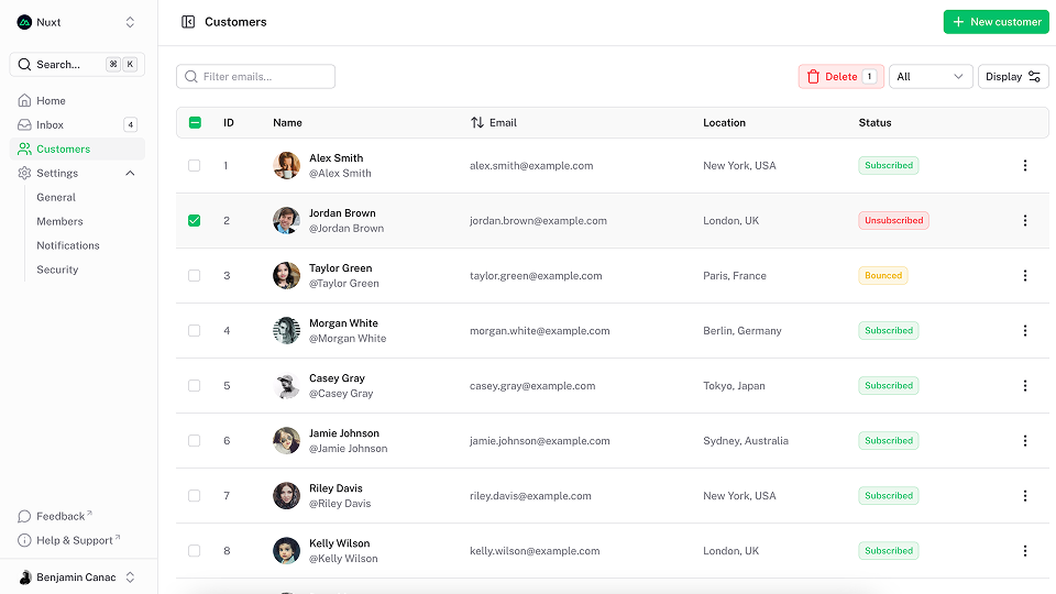
De PageHero-component verpakt uw inhoud in een Container met behoud van flexibiliteit over de volledige breedte, waardoor het gemakkelijk is om achtergrondkleuren, afbeeldingen of patronen toe te voegen. Het biedt een flexibele manier om inhoud weer te geven met een illustratie in de standaardsleuf.
Ultimate Vue UI library
Titel
Gebruik de title prop om de titel van de held in te stellen.
Ultimate Vue UI library
<template>
  <UPageHero title="Ultimate Vue UI library" />
</template>
Beschrijving
Gebruik de description prop om de beschrijving van de held in te stellen.
Ultimate Vue UI library
<template>
  <UPageHero
    title="Ultimate Vue UI library"
    description="A Nuxt/Vue-integrated UI library providing a rich set of fully-styled, accessible and highly customizable components for building modern web applications."
  />
</template>
Kop
Gebruik de headline prop om de kop van de held in te stellen.
Ultimate Vue UI library
<template>
  <UPageHero
    title="Ultimate Vue UI library"
    description="A Nuxt/Vue-integrated UI library providing a rich set of fully-styled, accessible and highly customizable components for building modern web applications."
    headline="New release"
  />
</template>
Links
Gebruik de links prop om een lijst met Button onder de beschrijving weer te geven.
Ultimate Vue UI library
<script setup lang="ts">
import type { ButtonProps } from '@nuxt/ui'

const links = ref<ButtonProps[]>([
  {
    label: 'Get started',
    to: '/docs/getting-started',
    icon: 'i-lucide-square-play'
  },
  {
    label: 'Learn more',
    to: '/docs/getting-started/theme/design-system',
    color: 'neutral',
    variant: 'subtle',
    trailingIcon: 'i-lucide-arrow-right'
  }
])
</script>

<template>
  <UPageHero
    title="Ultimate Vue UI library"
    description="A Nuxt/Vue-integrated UI library providing a rich set of fully-styled, accessible and highly customizable components for building modern web applications."
    :links="links"
  />
</template><script setup lang="ts">
import { ref } from 'vue'
import type { ButtonProps } from '@nuxt/ui'
const links = ref<ButtonProps[]>([
{
label: 'Get started',
to: '/docs/getting-started',
icon: 'i-lucide-square-play'
},
{
label: 'Learn more',
to: '/docs/getting-started/theme/design-system',
color: 'neutral',
variant: 'subtle',
trailingIcon: 'i-lucide-arrow-right'
}
])
</script>
<template>
<UPageHero
title="Ultimate Vue UI library"
description="A Nuxt/Vue-integrated UI library providing a rich set of fully-styled, accessible and highly customizable components for building modern web applications."
:links="links"
/>
</template>Oriëntatie
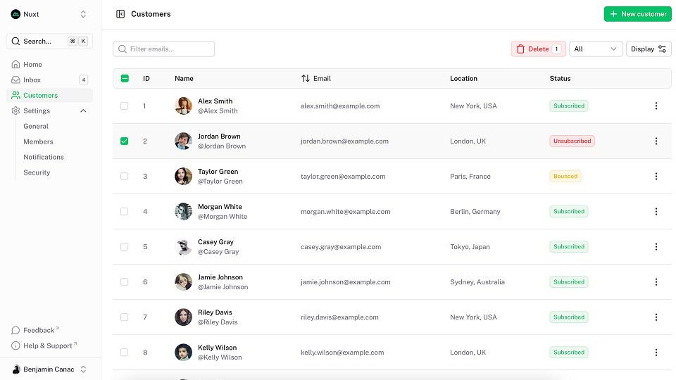
Gebruik de orientation-prop om de oriëntatie met de standaardsleuf te wijzigen. Standaard vertical.
Ultimate Vue UI library
<script setup lang="ts">
import type { ButtonProps } from '@nuxt/ui'

const links = ref<ButtonProps[]>([
  {
    label: 'Get started',
    to: '/docs/getting-started',
    icon: 'i-lucide-square-play'
  },
  {
    label: 'Learn more',
    to: '/docs/getting-started/theme/design-system',
    color: 'neutral',
    variant: 'subtle',
    trailingIcon: 'i-lucide-arrow-right'
  }
])
</script>

<template>
  <UPageHero
    title="Ultimate Vue UI library"
    description="A Nuxt/Vue-integrated UI library providing a rich set of fully-styled, accessible and highly customizable components for building modern web applications."
    headline="New release"
    orientation="horizontal"
    :links="links"
  >
    <img
      src="/blocks/image4.png"
      alt="App screenshot"
      class="rounded-lg shadow-2xl ring ring-default"
    />
  </UPageHero>
</template><script setup lang="ts">
import { ref } from 'vue'
import type { ButtonProps } from '@nuxt/ui'
const links = ref<ButtonProps[]>([
{
label: 'Get started',
to: '/docs/getting-started',
icon: 'i-lucide-square-play'
},
{
label: 'Learn more',
to: '/docs/getting-started/theme/design-system',
color: 'neutral',
variant: 'subtle',
trailingIcon: 'i-lucide-arrow-right'
}
])
</script>
<template>
<UPageHero
title="Ultimate Vue UI library"
description="A Nuxt/Vue-integrated UI library providing a rich set of fully-styled, accessible and highly customizable components for building modern web applications."
headline="New release"
orientation="horizontal"
:links="links"
>
<img
src="/blocks/image4.png"
alt="App screenshot"
class="rounded-lg shadow-2xl ring ring-default"
/>
</UPageHero>
</template>Omkeren
Gebruik de reverse prop om de oriëntatie van de standaardsleuf om te keren.
Ultimate Vue UI library
<script setup lang="ts">
import type { ButtonProps } from '@nuxt/ui'

const links = ref<ButtonProps[]>([
  {
    label: 'Get started',
    to: '/docs/getting-started',
    icon: 'i-lucide-square-play'
  },
  {
    label: 'Learn more',
    to: '/docs/getting-started/theme/design-system',
    color: 'neutral',
    variant: 'subtle',
    trailingIcon: 'i-lucide-arrow-right'
  }
])
</script>

<template>
  <UPageHero
    title="Ultimate Vue UI library"
    description="A Nuxt/Vue-integrated UI library providing a rich set of fully-styled, accessible and highly customizable components for building modern web applications."
    headline="New release"
    orientation="horizontal"
    reverse
    :links="links"
  >
    <img
      src="/blocks/image4.png"
      alt="App screenshot"
      class="rounded-lg shadow-2xl ring ring-default"
    />
  </UPageHero>
</template><script setup lang="ts">
import { ref } from 'vue'
import type { ButtonProps } from '@nuxt/ui'
const links = ref<ButtonProps[]>([
{
label: 'Get started',
to: '/docs/getting-started',
icon: 'i-lucide-square-play'
},
{
label: 'Learn more',
to: '/docs/getting-started/theme/design-system',
color: 'neutral',
variant: 'subtle',
trailingIcon: 'i-lucide-arrow-right'
}
])
</script>
<template>
<UPageHero
title="Ultimate Vue UI library"
description="A Nuxt/Vue-integrated UI library providing a rich set of fully-styled, accessible and highly customizable components for building modern web applications."
headline="New release"
orientation="horizontal"
reverse
:links="links"
>
<img
src="/blocks/image4.png"
alt="App screenshot"
class="rounded-lg shadow-2xl ring ring-default"
/>
</UPageHero>
</template>API
Props
| Prop | Default | Type |
|---|---|---|
as | 'div' | anyThe element or component this component should render as. |
headline | string | |
title | string | |
description | string | |
links | ButtonProps[]Display a list of Button under the description.
| |
orientation | 'vertical' | "horizontal" | "vertical"The orientation of the page hero. |
reverse | false | boolean Reverse the order of the default slot. |
ui | { root?: SlotClass; container?: SlotClass; wrapper?: SlotClass; header?: SlotClass; headline?: SlotClass; title?: SlotClass; description?: SlotClass; body?: SlotClass; footer?: SlotClass; links?: SlotClass; } |
Slots
| Slot | Type |
|---|---|
top | {} |
header | {} |
headline | {} |
title | {} |
description | {} |
body | {} |
footer | {} |
links | {} |
default | {} |
bottom | {} |
Thema
export default defineAppConfig({
  ui: {
    pageHero: {
      slots: {
        root: 'relative isolate',
        container: 'flex flex-col lg:grid py-24 sm:py-32 lg:py-40 gap-16 sm:gap-y-24',
        wrapper: '',
        header: '',
        headline: 'mb-4',
        title: 'text-5xl sm:text-7xl text-pretty tracking-tight font-bold text-highlighted',
        description: 'text-lg sm:text-xl/8 text-muted',
        body: 'mt-10',
        footer: 'mt-10',
        links: 'flex flex-wrap gap-x-6 gap-y-3'
      },
      variants: {
        orientation: {
          horizontal: {
            container: 'lg:grid-cols-2 lg:items-center',
            description: 'text-pretty'
          },
          vertical: {
            container: '',
            headline: 'justify-center',
            wrapper: 'text-center',
            description: 'text-balance',
            links: 'justify-center'
          }
        },
        reverse: {
          true: {
            wrapper: 'order-last'
          }
        },
        headline: {
          true: {
            headline: 'font-semibold text-primary flex items-center gap-1.5'
          }
        },
        title: {
          true: {
            description: 'mt-6'
          }
        }
      }
    }
  }
})import { defineConfig } from 'vite'
import vue from '@vitejs/plugin-vue'
import ui from '@nuxt/ui/vite'
export default defineConfig({
plugins: [
vue(),
ui({
ui: {
pageHero: {
slots: {
root: 'relative isolate',
container: 'flex flex-col lg:grid py-24 sm:py-32 lg:py-40 gap-16 sm:gap-y-24',
wrapper: '',
header: '',
headline: 'mb-4',
title: 'text-5xl sm:text-7xl text-pretty tracking-tight font-bold text-highlighted',
description: 'text-lg sm:text-xl/8 text-muted',
body: 'mt-10',
footer: 'mt-10',
links: 'flex flex-wrap gap-x-6 gap-y-3'
},
variants: {
orientation: {
horizontal: {
container: 'lg:grid-cols-2 lg:items-center',
description: 'text-pretty'
},
vertical: {
container: '',
headline: 'justify-center',
wrapper: 'text-center',
description: 'text-balance',
links: 'justify-center'
}
},
reverse: {
true: {
wrapper: 'order-last'
}
},
headline: {
true: {
headline: 'font-semibold text-primary flex items-center gap-1.5'
}
},
title: {
true: {
description: 'mt-6'
}
}
}
}
}
})
]
})