Pagañón
xph0000xUso
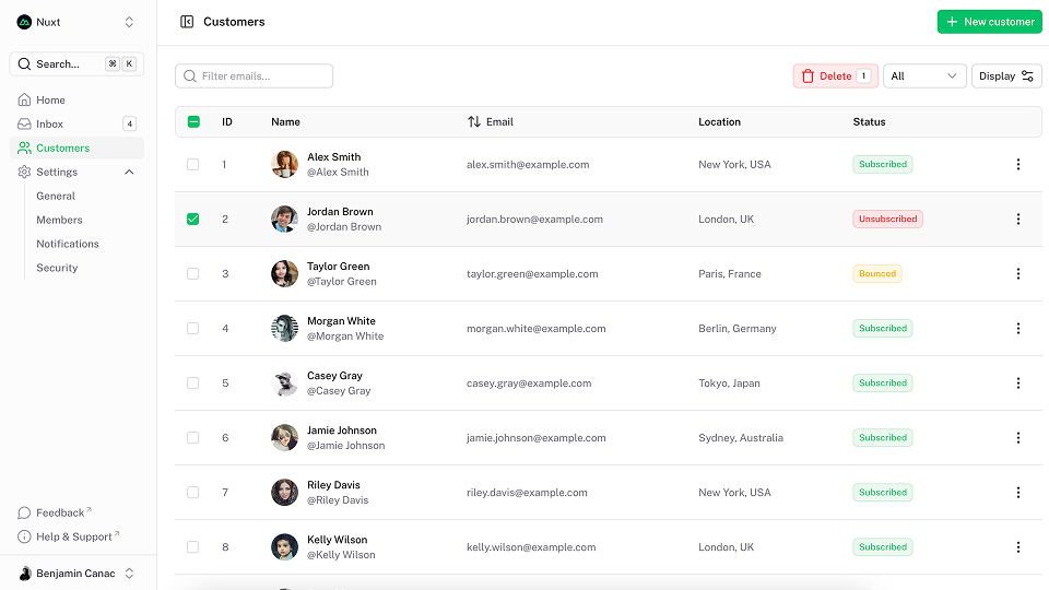
El componente PageHero envuelve su contenido en un Container mientras mantiene la flexibilidad de ancho completo, lo que facilita la adición de colores de fondo, imágenes o patrones.
Ultimate Vue UI library
x{width="960" height="540" class="rounded-sm shadow-2xl ring ring-default"}
Nombre
Utilice el prop title para establecer el título del héroe.
Ultimate Vue UI library
<template>
  <UPageHero title="Ultimate Vue UI library" />
</template>
Descripción
Utilice el prop description para establecer la descripción del héroe.
Ultimate Vue UI library
<template>
  <UPageHero
    title="Ultimate Vue UI library"
    description="A Nuxt/Vue-integrated UI library providing a rich set of fully-styled, accessible and highly customizable components for building modern web applications."
  />
</template>
Categoría
Utilice el accesorio headline para establecer el titular del héroe.
Ultimate Vue UI library
<template>
  <UPageHero
    title="Ultimate Vue UI library"
    description="A Nuxt/Vue-integrated UI library providing a rich set of fully-styled, accessible and highly customizable components for building modern web applications."
    headline="New release"
  />
</template>
Enlaces
Utilice el prop links para mostrar una lista de Button debajo de la descripción.
Ultimate Vue UI library
<script setup lang="ts">
import type { ButtonProps } from '@nuxt/ui'

const links = ref<ButtonProps[]>([
  {
    label: 'Get started',
    to: '/docs/getting-started',
    icon: 'i-lucide-square-play'
  },
  {
    label: 'Learn more',
    to: '/docs/getting-started/theme/design-system',
    color: 'neutral',
    variant: 'subtle',
    trailingIcon: 'i-lucide-arrow-right'
  }
])
</script>

<template>
  <UPageHero
    title="Ultimate Vue UI library"
    description="A Nuxt/Vue-integrated UI library providing a rich set of fully-styled, accessible and highly customizable components for building modern web applications."
    :links="links"
  />
</template><script setup lang="ts">
import { ref } from 'vue'
import type { ButtonProps } from '@nuxt/ui'
const links = ref<ButtonProps[]>([
{
label: 'Get started',
to: '/docs/getting-started',
icon: 'i-lucide-square-play'
},
{
label: 'Learn more',
to: '/docs/getting-started/theme/design-system',
color: 'neutral',
variant: 'subtle',
trailingIcon: 'i-lucide-arrow-right'
}
])
</script>
<template>
<UPageHero
title="Ultimate Vue UI library"
description="A Nuxt/Vue-integrated UI library providing a rich set of fully-styled, accessible and highly customizable components for building modern web applications."
:links="links"
/>
</template>Orientación
Utilice el accesorio orientation para cambiar la orientación con la ranura predeterminada.
Ultimate Vue UI library

<script setup lang="ts">
import type { ButtonProps } from '@nuxt/ui'

const links = ref<ButtonProps[]>([
  {
    label: 'Get started',
    to: '/docs/getting-started',
    icon: 'i-lucide-square-play'
  },
  {
    label: 'Learn more',
    to: '/docs/getting-started/theme/design-system',
    color: 'neutral',
    variant: 'subtle',
    trailingIcon: 'i-lucide-arrow-right'
  }
])
</script>

<template>
  <UPageHero
    title="Ultimate Vue UI library"
    description="A Nuxt/Vue-integrated UI library providing a rich set of fully-styled, accessible and highly customizable components for building modern web applications."
    headline="New release"
    orientation="horizontal"
    :links="links"
  >
    <img
      src="/blocks/image4.png"
      alt="App screenshot"
      class="rounded-lg shadow-2xl ring ring-default"
    />
  </UPageHero>
</template><script setup lang="ts">
import { ref } from 'vue'
import type { ButtonProps } from '@nuxt/ui'
const links = ref<ButtonProps[]>([
{
label: 'Get started',
to: '/docs/getting-started',
icon: 'i-lucide-square-play'
},
{
label: 'Learn more',
to: '/docs/getting-started/theme/design-system',
color: 'neutral',
variant: 'subtle',
trailingIcon: 'i-lucide-arrow-right'
}
])
</script>
<template>
<UPageHero
title="Ultimate Vue UI library"
description="A Nuxt/Vue-integrated UI library providing a rich set of fully-styled, accessible and highly customizable components for building modern web applications."
headline="New release"
orientation="horizontal"
:links="links"
>
<img
src="/blocks/image4.png"
alt="App screenshot"
class="rounded-lg shadow-2xl ring ring-default"
/>
</UPageHero>
</template>Reverse (Edición española)
Utilice el prop reverse para invertir la orientación de la ranura predeterminada.
Ultimate Vue UI library
<script setup lang="ts">
import type { ButtonProps } from '@nuxt/ui'

const links = ref<ButtonProps[]>([
  {
    label: 'Get started',
    to: '/docs/getting-started',
    icon: 'i-lucide-square-play'
  },
  {
    label: 'Learn more',
    to: '/docs/getting-started/theme/design-system',
    color: 'neutral',
    variant: 'subtle',
    trailingIcon: 'i-lucide-arrow-right'
  }
])
</script>

<template>
  <UPageHero
    title="Ultimate Vue UI library"
    description="A Nuxt/Vue-integrated UI library providing a rich set of fully-styled, accessible and highly customizable components for building modern web applications."
    headline="New release"
    orientation="horizontal"
    reverse
    :links="links"
  >
    <img
      src="/blocks/image4.png"
      alt="App screenshot"
      class="rounded-lg shadow-2xl ring ring-default"
    />
  </UPageHero>
</template><script setup lang="ts">
import { ref } from 'vue'
import type { ButtonProps } from '@nuxt/ui'
const links = ref<ButtonProps[]>([
{
label: 'Get started',
to: '/docs/getting-started',
icon: 'i-lucide-square-play'
},
{
label: 'Learn more',
to: '/docs/getting-started/theme/design-system',
color: 'neutral',
variant: 'subtle',
trailingIcon: 'i-lucide-arrow-right'
}
])
</script>
<template>
<UPageHero
title="Ultimate Vue UI library"
description="A Nuxt/Vue-integrated UI library providing a rich set of fully-styled, accessible and highly customizable components for building modern web applications."
headline="New release"
orientation="horizontal"
reverse
:links="links"
>
<img
src="/blocks/image4.png"
alt="App screenshot"
class="rounded-lg shadow-2xl ring ring-default"
/>
</UPageHero>
</template>API (Versión)
Accesorios
| Prop | Default | Type |
|---|---|---|
as | 'div' | anyThe element or component this component should render as. |
headline | string | |
title | string | |
description | string | |
links | ButtonProps[]Display a list of Button under the description.
| |
orientation | 'vertical' | "horizontal" | "vertical"The orientation of the page hero. |
reverse | false | boolean Reverse the order of the default slot. |
ui | { root?: SlotClass; container?: SlotClass; wrapper?: SlotClass; header?: SlotClass; headline?: SlotClass; title?: SlotClass; description?: SlotClass; body?: SlotClass; footer?: SlotClass; links?: SlotClass; } |
Slots
| Slot | Type |
|---|---|
top | {} |
header | {} |
headline | {} |
title | {} |
description | {} |
body | {} |
footer | {} |
links | {} |
default | {} |
bottom | {} |
Temas
export default defineAppConfig({
  ui: {
    pageHero: {
      slots: {
        root: 'relative isolate',
        container: 'flex flex-col lg:grid py-24 sm:py-32 lg:py-40 gap-16 sm:gap-y-24',
        wrapper: '',
        header: '',
        headline: 'mb-4',
        title: 'text-5xl sm:text-7xl text-pretty tracking-tight font-bold text-highlighted',
        description: 'text-lg sm:text-xl/8 text-muted',
        body: 'mt-10',
        footer: 'mt-10',
        links: 'flex flex-wrap gap-x-6 gap-y-3'
      },
      variants: {
        orientation: {
          horizontal: {
            container: 'lg:grid-cols-2 lg:items-center',
            description: 'text-pretty'
          },
          vertical: {
            container: '',
            headline: 'justify-center',
            wrapper: 'text-center',
            description: 'text-balance',
            links: 'justify-center'
          }
        },
        reverse: {
          true: {
            wrapper: 'order-last'
          }
        },
        headline: {
          true: {
            headline: 'font-semibold text-primary flex items-center gap-1.5'
          }
        },
        title: {
          true: {
            description: 'mt-6'
          }
        }
      }
    }
  }
})import { defineConfig } from 'vite'
import vue from '@vitejs/plugin-vue'
import ui from '@nuxt/ui/vite'
export default defineConfig({
plugins: [
vue(),
ui({
ui: {
pageHero: {
slots: {
root: 'relative isolate',
container: 'flex flex-col lg:grid py-24 sm:py-32 lg:py-40 gap-16 sm:gap-y-24',
wrapper: '',
header: '',
headline: 'mb-4',
title: 'text-5xl sm:text-7xl text-pretty tracking-tight font-bold text-highlighted',
description: 'text-lg sm:text-xl/8 text-muted',
body: 'mt-10',
footer: 'mt-10',
links: 'flex flex-wrap gap-x-6 gap-y-3'
},
variants: {
orientation: {
horizontal: {
container: 'lg:grid-cols-2 lg:items-center',
description: 'text-pretty'
},
vertical: {
container: '',
headline: 'justify-center',
wrapper: 'text-center',
description: 'text-balance',
links: 'justify-center'
}
},
reverse: {
true: {
wrapper: 'order-last'
}
},
headline: {
true: {
headline: 'font-semibold text-primary flex items-center gap-1.5'
}
},
title: {
true: {
description: 'mt-6'
}
}
}
}
}
})
]
})