PageHero ist
Bearbeiten
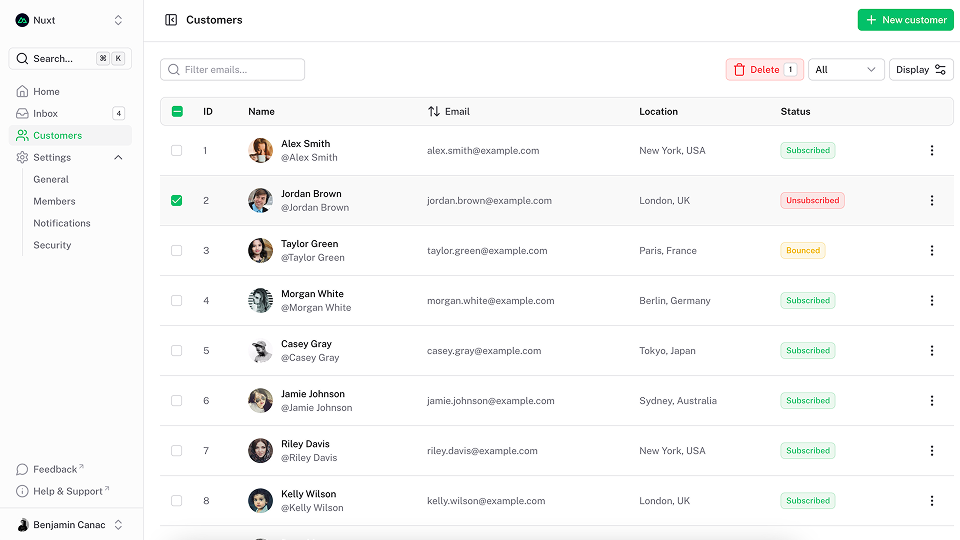
Die PageHero-Komponente umhüllt Ihre Inhalte in einem Container und behält dabei die Flexibilität der vollen Breite bei, sodass Hintergrundfarben, Bilder oder Muster einfach hinzugefügt werden können.
Ultimate Vue UI library
xph014title Übersetzung
Verwenden Sie die title prop, um den Titel des Helden zu setzen.
Ultimate Vue UI library
<template>
  <UPageHero title="Ultimate Vue UI library" />
</template>
Beschreibung
Verwenden Sie die description-Prop, um die Beschreibung des Helden festzulegen.
Ultimate Vue UI library
<template>
  <UPageHero
    title="Ultimate Vue UI library"
    description="A Nuxt/Vue-integrated UI library providing a rich set of fully-styled, accessible and highly customizable components for building modern web applications."
  />
</template>
Headline Übersetzung
Verwenden Sie die headline-Prop, um die Überschrift des Helden zu setzen.
Ultimate Vue UI library
<template>
  <UPageHero
    title="Ultimate Vue UI library"
    description="A Nuxt/Vue-integrated UI library providing a rich set of fully-styled, accessible and highly customizable components for building modern web applications."
    headline="New release"
  />
</template>
Links (englisch)
Verwenden Sie die links-Prop, um eine Liste von Button unter der Beschreibung anzuzeigen.
Ultimate Vue UI library
<script setup lang="ts">
import type { ButtonProps } from '@nuxt/ui'

const links = ref<ButtonProps[]>([
  {
    label: 'Get started',
    to: '/docs/getting-started',
    icon: 'i-lucide-square-play'
  },
  {
    label: 'Learn more',
    to: '/docs/getting-started/theme/design-system',
    color: 'neutral',
    variant: 'subtle',
    trailingIcon: 'i-lucide-arrow-right'
  }
])
</script>

<template>
  <UPageHero
    title="Ultimate Vue UI library"
    description="A Nuxt/Vue-integrated UI library providing a rich set of fully-styled, accessible and highly customizable components for building modern web applications."
    :links="links"
  />
</template><script setup lang="ts">
import { ref } from 'vue'
import type { ButtonProps } from '@nuxt/ui'
const links = ref<ButtonProps[]>([
{
label: 'Get started',
to: '/docs/getting-started',
icon: 'i-lucide-square-play'
},
{
label: 'Learn more',
to: '/docs/getting-started/theme/design-system',
color: 'neutral',
variant: 'subtle',
trailingIcon: 'i-lucide-arrow-right'
}
])
</script>
<template>
<UPageHero
title="Ultimate Vue UI library"
description="A Nuxt/Vue-integrated UI library providing a rich set of fully-styled, accessible and highly customizable components for building modern web applications."
:links="links"
/>
</template>Orientierung.
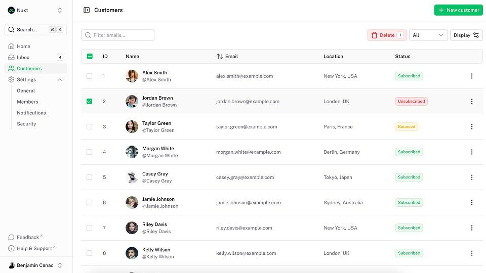
Verwenden Sie die orientation-Prop, um die Ausrichtung mit dem Standardslot zu ändern. Standardmäßig ist vertical.
Ultimate Vue UI library
<script setup lang="ts">
import type { ButtonProps } from '@nuxt/ui'

const links = ref<ButtonProps[]>([
  {
    label: 'Get started',
    to: '/docs/getting-started',
    icon: 'i-lucide-square-play'
  },
  {
    label: 'Learn more',
    to: '/docs/getting-started/theme/design-system',
    color: 'neutral',
    variant: 'subtle',
    trailingIcon: 'i-lucide-arrow-right'
  }
])
</script>

<template>
  <UPageHero
    title="Ultimate Vue UI library"
    description="A Nuxt/Vue-integrated UI library providing a rich set of fully-styled, accessible and highly customizable components for building modern web applications."
    headline="New release"
    orientation="horizontal"
    :links="links"
  >
    <img
      src="/blocks/image4.png"
      alt="App screenshot"
      class="rounded-lg shadow-2xl ring ring-default"
    />
  </UPageHero>
</template><script setup lang="ts">
import { ref } from 'vue'
import type { ButtonProps } from '@nuxt/ui'
const links = ref<ButtonProps[]>([
{
label: 'Get started',
to: '/docs/getting-started',
icon: 'i-lucide-square-play'
},
{
label: 'Learn more',
to: '/docs/getting-started/theme/design-system',
color: 'neutral',
variant: 'subtle',
trailingIcon: 'i-lucide-arrow-right'
}
])
</script>
<template>
<UPageHero
title="Ultimate Vue UI library"
description="A Nuxt/Vue-integrated UI library providing a rich set of fully-styled, accessible and highly customizable components for building modern web applications."
headline="New release"
orientation="horizontal"
:links="links"
>
<img
src="/blocks/image4.png"
alt="App screenshot"
class="rounded-lg shadow-2xl ring ring-default"
/>
</UPageHero>
</template>Umgekehrtes
Verwenden Sie die reverse-Prop, um die Ausrichtung des Standardsteckplatzes umzukehren.
Ultimate Vue UI library
<script setup lang="ts">
import type { ButtonProps } from '@nuxt/ui'

const links = ref<ButtonProps[]>([
  {
    label: 'Get started',
    to: '/docs/getting-started',
    icon: 'i-lucide-square-play'
  },
  {
    label: 'Learn more',
    to: '/docs/getting-started/theme/design-system',
    color: 'neutral',
    variant: 'subtle',
    trailingIcon: 'i-lucide-arrow-right'
  }
])
</script>

<template>
  <UPageHero
    title="Ultimate Vue UI library"
    description="A Nuxt/Vue-integrated UI library providing a rich set of fully-styled, accessible and highly customizable components for building modern web applications."
    headline="New release"
    orientation="horizontal"
    reverse
    :links="links"
  >
    <img
      src="/blocks/image4.png"
      alt="App screenshot"
      class="rounded-lg shadow-2xl ring ring-default"
    />
  </UPageHero>
</template><script setup lang="ts">
import { ref } from 'vue'
import type { ButtonProps } from '@nuxt/ui'
const links = ref<ButtonProps[]>([
{
label: 'Get started',
to: '/docs/getting-started',
icon: 'i-lucide-square-play'
},
{
label: 'Learn more',
to: '/docs/getting-started/theme/design-system',
color: 'neutral',
variant: 'subtle',
trailingIcon: 'i-lucide-arrow-right'
}
])
</script>
<template>
<UPageHero
title="Ultimate Vue UI library"
description="A Nuxt/Vue-integrated UI library providing a rich set of fully-styled, accessible and highly customizable components for building modern web applications."
headline="New release"
orientation="horizontal"
reverse
:links="links"
>
<img
src="/blocks/image4.png"
alt="App screenshot"
class="rounded-lg shadow-2xl ring ring-default"
/>
</UPageHero>
</template>API (Englisch)
Props Bearbeiten
| Prop | Default | Type |
|---|---|---|
as | 'div' | anyThe element or component this component should render as. |
headline | string | |
title | string | |
description | string | |
links | ButtonProps[]Display a list of Button under the description.
| |
orientation | 'vertical' | "horizontal" | "vertical"The orientation of the page hero. |
reverse | false | boolean Reverse the order of the default slot. |
ui | { root?: SlotClass; container?: SlotClass; wrapper?: SlotClass; header?: SlotClass; headline?: SlotClass; title?: SlotClass; description?: SlotClass; body?: SlotClass; footer?: SlotClass; links?: SlotClass; } |
Slots (englisch)
| Slot | Type |
|---|---|
top | {} |
header | {} |
headline | {} |
title | {} |
description | {} |
body | {} |
footer | {} |
links | {} |
default | {} |
bottom | {} |
Theme Bearbeiten
export default defineAppConfig({
  ui: {
    pageHero: {
      slots: {
        root: 'relative isolate',
        container: 'flex flex-col lg:grid py-24 sm:py-32 lg:py-40 gap-16 sm:gap-y-24',
        wrapper: '',
        header: '',
        headline: 'mb-4',
        title: 'text-5xl sm:text-7xl text-pretty tracking-tight font-bold text-highlighted',
        description: 'text-lg sm:text-xl/8 text-muted',
        body: 'mt-10',
        footer: 'mt-10',
        links: 'flex flex-wrap gap-x-6 gap-y-3'
      },
      variants: {
        orientation: {
          horizontal: {
            container: 'lg:grid-cols-2 lg:items-center',
            description: 'text-pretty'
          },
          vertical: {
            container: '',
            headline: 'justify-center',
            wrapper: 'text-center',
            description: 'text-balance',
            links: 'justify-center'
          }
        },
        reverse: {
          true: {
            wrapper: 'order-last'
          }
        },
        headline: {
          true: {
            headline: 'font-semibold text-primary flex items-center gap-1.5'
          }
        },
        title: {
          true: {
            description: 'mt-6'
          }
        }
      }
    }
  }
})import { defineConfig } from 'vite'
import vue from '@vitejs/plugin-vue'
import ui from '@nuxt/ui/vite'
export default defineConfig({
plugins: [
vue(),
ui({
ui: {
pageHero: {
slots: {
root: 'relative isolate',
container: 'flex flex-col lg:grid py-24 sm:py-32 lg:py-40 gap-16 sm:gap-y-24',
wrapper: '',
header: '',
headline: 'mb-4',
title: 'text-5xl sm:text-7xl text-pretty tracking-tight font-bold text-highlighted',
description: 'text-lg sm:text-xl/8 text-muted',
body: 'mt-10',
footer: 'mt-10',
links: 'flex flex-wrap gap-x-6 gap-y-3'
},
variants: {
orientation: {
horizontal: {
container: 'lg:grid-cols-2 lg:items-center',
description: 'text-pretty'
},
vertical: {
container: '',
headline: 'justify-center',
wrapper: 'text-center',
description: 'text-balance',
links: 'justify-center'
}
},
reverse: {
true: {
wrapper: 'order-last'
}
},
headline: {
true: {
headline: 'font-semibold text-primary flex items-center gap-1.5'
}
},
title: {
true: {
description: 'mt-6'
}
}
}
}
}
})
]
})